
Case Study — Product, Brand & Website
Bonelo: a social platform built around giving time, not money
People ask for practical help, offer time, skills or items, and follow the difference their contribution makes. No donations, no payments, no follower counts.
How this project relates to WeDevelop
Bonelo is a WeDevelop-founded initiative, developed by Lance Connolly through WeDevelop — not an independent client engagement. This page reports no client results, user numbers or commercial performance. It is published because it shows our full range of work on one project we can describe honestly.
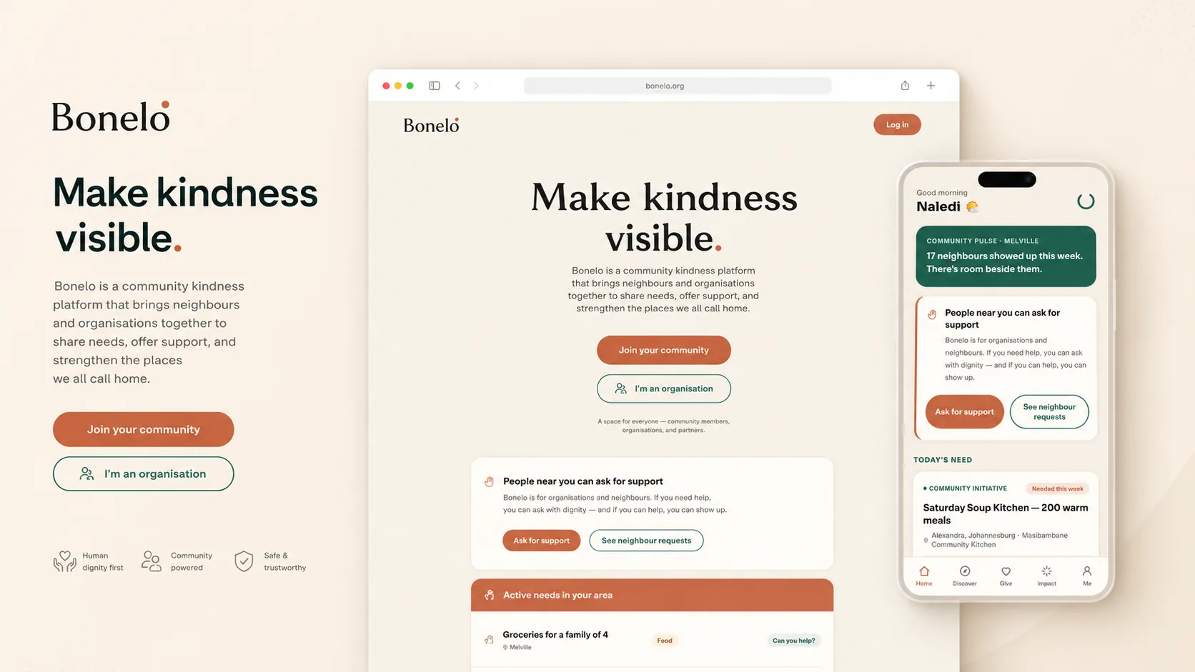
Project summary
What Bonelo is, and what we were responsible for
Someone posts a genuine need — a lift to an appointment, school supplies, an hour of a skill. Someone else contributes what they actually have. The people involved confirm what happened, so help is recorded rather than announced.
It is built for individuals first. Schools, community kitchens and NGOs are welcome, but they post into the same feed as everyone else rather than above it.
WeDevelop was responsible for turning that idea into something usable: what the product does, in what order, what it is called, what it looks like, and the website that introduces it. The platform build itself sits ahead of this work — see current status.
- Category and market
- Social platform for community generosity, South Africa
- Relationship
- WeDevelop-founded initiative, not a client engagement
- Current stage
- Website live, founding community forming, platform not yet built
- Capabilities shown
- Product strategy, MVP scoping, brand identity, journey design, responsive interface design, front-end implementation
The challenge
Generosity is easy to feel and hard to explain
People already help each other constantly, mostly across WhatsApp groups and neighbourhood pages. The difficulty was never persuading anyone that kindness matters. It was building something specific enough to use, when the subject is broad, emotional and easy to make vague.
-
Explaining a product that takes no money
“Contribute time, skills or transport” had to land as concretely as a payment button, without borrowing the language of fundraising.
-
Earning trust with no track record
Asking people to post a real need is asking for something risky. Trust had to be built into the mechanics rather than claimed in the copy.
-
Warmth without losing clarity
Too far toward feeling and it becomes a mood board nobody can use. Too far toward structure and it becomes a ticketing system for hardship.
-
Dignity as a design constraint
Making needs visible without turning circumstances into content ruled out most standard social-product behaviour.
How we worked through it
- Product model
- Audience
- Customer journey
- Brand
- Interface
- Launch foundation
Each stage began only once the previous one was settled. The temptation on a project like this is to start with the logo; we started with what a person actually does here, and how anyone knows it happened. The decisions below are where that sequence was resolved.
Key decisions
Five decisions that shaped the product
These are the choices that closed off other options. Each one removed work, resolved an argument, or made a later screen possible.
-
Non-financial contribution as the core model
- Decision, and why
- Bonelo processes no money at all. People give time, skills, items, transport and recognition. Payments would have made it instantly familiar — and instantly a fundraising platform, carrying regulation and the assumption that help means cash.
- What it enables
- Anyone can contribute regardless of income, and payment infrastructure, compliance and fraud exposure leave the first build entirely.
-
Confirmation before recognition
- Decision, and why
- A contribution is confirmed by the people involved before it counts, producing an Impact Receipt. If people can claim credit for helping, some will claim it without helping; recognition built on self-reporting corrodes quickly.
- What it enables
- Trust becomes structural rather than promotional, and Bonelo Points gain a defensible meaning: verified contribution, not activity.
-
Familiar layout, different incentives
- Decision, and why
- Keep the feed people already know; remove every popularity mechanic. An unfamiliar interface needs teaching. A conventional social one imports exactly the behaviour Bonelo exists to avoid.
- What it enables
- Immediate usability, while the only available actions are ones that help someone. Nothing on screen rewards performance.
-
People first, organisations alongside
- Decision, and why
- Verified organisations post into the same feed as everyone else, clearly labelled but not elevated above a neighbour. A privileged surface for them would make Bonelo a directory of causes and quietly tell individuals their small request did not belong.
- What it enables
- Reach and coordination without changing whose platform it is. One school uniform sits alongside a community kitchen, and neither looks out of place.
-
A public website before the platform
- Decision, and why
- Launch the explanation first — a public website with a founding community, labelling product previews as previews. Building the platform first spends the most money at the point of least certainty.
- What it enables
- Real reactions while scope is still movable, an audience before launch day, and honesty about what exists — which matters for a platform asking to be trusted with a genuine need.
Customer journey
The loop the whole product is built around
Every screen exists to move someone one step further along this path. Designing it as a closed loop — ending in something visible rather than a thank-you page — is what makes contribution feel worth repeating.
-
Discover a need or initiative
A request, an offer or a trusted community initiative near them.
-
Choose how to contribute
A form of help that fits their life — an hour, a skill, a lift, items they already have.
-
Contribute
The exchange moves from a public post into a direct, safer interaction between the people involved.
-
Confirm what happened
The people involved confirm it and an Impact Receipt records it. Everything else depends on this step.
-
Recognise and thank
Gratitude and recognition close the exchange, so the person who showed up knows it mattered.
-
Follow the Impact Journey
Confirmed contributions build a visible record, reflected through Bonelo Points — verified contribution, never money.
This is the designed journey and the structure the interface work was built against. The platform that runs it is not live yet.
Brand and design system
An identity that says “I see you” without drawing an eye
Bonelo needed to avoid the whole visual vocabulary of charity — hearts, cupped hands, hopeful stock photography — because none of it describes what the product does. The identity had to carry recognition and belonging instead.

The Seen B
A custom letter B carrying a small offset dot high in its upper bowl. The dot is a point of presence — someone is here, someone has been acknowledged. It sits deliberately off-centre, because centred it would read as an eye.
The name works the same way. Bonelo is a created name drawn from the territory around Sawubona, the act of truly seeing another person, and Ubuntu, the idea that our humanity is shaped through one another.
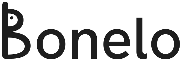
Bonelo colour palette and typography
- Ubuntu Clay#C96F4A
- Deep Belonging Green#1F5C4D
- Warm Sand#F7F1E8
- Charcoal#1E1E1E
- Soft Gold#E6B85C
- Soft White#FFFDF8
Warm Sand is the primary surface, because it keeps a feed about real hardship calm where plain white would feel institutional. Clay carries community warmth, Deep Belonging Green anchors trust, and Soft Gold is reserved for recognition alone — restrained so it never reads as coins or reward. Sora sets headings, Inter sets body copy, chosen for legibility on the mid-range Android screens most of the audience will use.
Where generosity belongs.
How the Seen B is constructed
- Strong, grounded stem
- Strong without being heavy, giving structure so the rounder bowls sit inside a dependable frame.
- High waist
- The elevated meeting point creates the distinctive silhouette and lets each bowl do a different job.
- Breathing upper bowl
- Lighter and more open, creating air around the dot. It should feel held, not enclosed.
- Generous lower bowl
- Larger, rounder and firmly anchored — support and belonging rather than fragility.
- Offset presence dot
- Small and calm, high and to the left. Optically enlarged at favicon sizes so presence survives at 16px.
- Shared geometry
- Symbol and wordmark B use the same vectors and are never redrawn independently.
Implementation
What we actually built, and how it was built to grow
The public website is fast and mobile-first, because the audience is largely on mid-range Android phones and variable connections. Nothing important depends on JavaScript loading successfully.
The information architecture follows the product journey: what Bonelo is, who it is for, how it works, why it exists, how to join. Someone can read three sections and stop, and still understand the proposition.
The interface was built as reusable patterns rather than one-off page designs — the same feed card, contribution state and recognition treatment the platform will need. That is the practical difference between a launch page and a launch foundation.
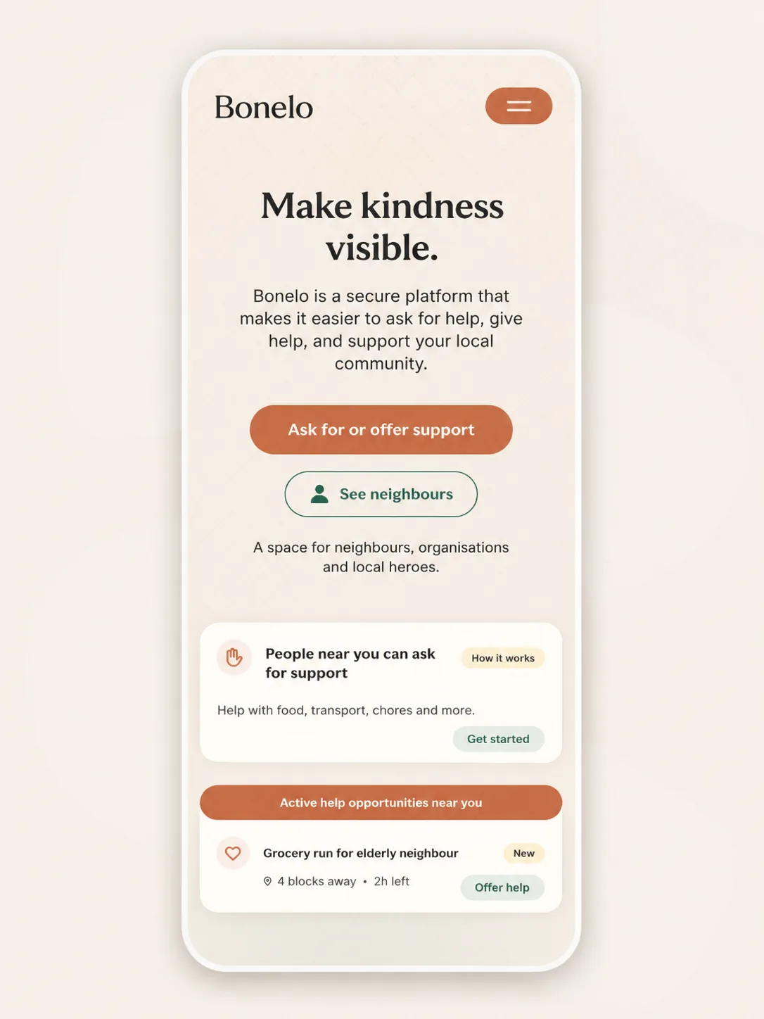
Screens and visual evidence
The interface decisions, on screen
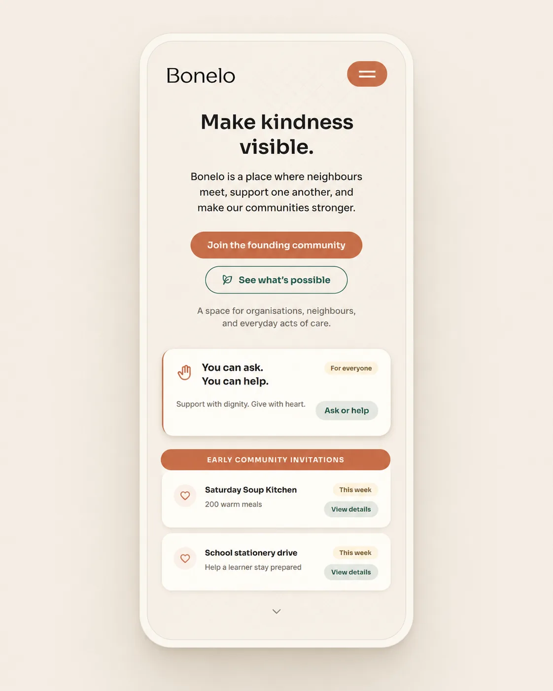
Three screens where a product decision became something a person can actually use. All are design and prototype work — the platform is not live.
The feed, with the popularity mechanics removed
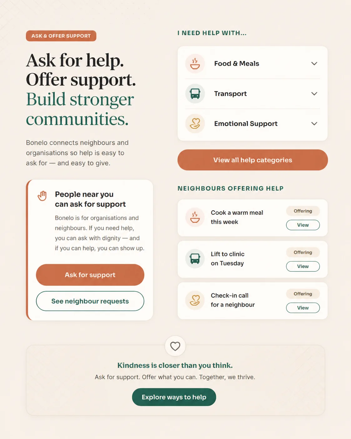
A structure everyone recognises, carrying content nobody else carries: open requests, open offers, trusted initiatives, contributions awaiting confirmation, confirmed impact updates. There is no like button or follower count anywhere in the design. The available actions are Offer help, Respond, Contribute, Thank and Recognise — every one of them does something for another person.
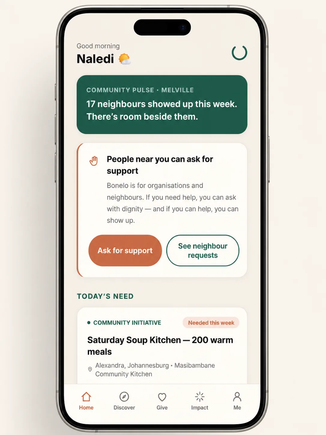
Making “what can I give?” answerable
The hardest moment in a non-financial platform is when someone wants to help and cannot think what they have. A payment field never has this problem; a blank contribution box always does. The answer was to show rather than explain — everyday examples on both sides, from carrying furniture to an hour of a skill, so the question is answered before it is asked.
A founding community, not a waiting list
A waiting list asks people to wait. The founding community asks them to participate — follow the build, share ideas, test early versions — and routes them into a private WhatsApp group where that conversation happens. Free, no obligation. For a platform built on trust, the first commitment it asks for should not be a transaction.
Current status
Exactly where the project stands
Bonelo is an early-stage project and this page treats it as one. The split below is the honest position as at August 2026.
Live now
- The public website at bonelo.org
- Founding-community signup, routing into a private WhatsApp community
- The complete brand identity: name, symbol, wordmark, palette, typography
- Product proposition, positioning and public explanation
In progress
- Founding community forming — no membership figures are published
- Final vector polish and the custom-drawn wordmark
- MVP scope definition for the platform build
- Interface patterns being extended from website into product
Designed, not yet built
- The Bonelo platform itself — feed, requests, offers, profiles
- Contribution confirmation and Impact Receipts
- Impact Journey and Bonelo Points
- Organisation verification and community safety tooling
Product screens shown on this page are design and prototype work, labelled as previews on the Bonelo site itself. No user numbers, engagement figures, revenue or growth results are claimed here, because the platform has not launched and there are none to report.
What this demonstrates
What this work says about how we’d handle yours
Bonelo is a platform, not a business website. But the reasoning is the same reasoning we apply commercially, and it is the part most agencies never show you.
- Turning a broad idea into a specific proposition In language a stranger understands in one read.
- Designing the journey before the pages What a person does, in what order, and what tells them it worked.
- Building a credible brand from the product Name, symbol and palette derived from what the thing does.
- Controlling scope so something ships And being explicit about what was left out.
- Responsive implementation that holds up Mobile-first, fast, accessible, working without JavaScript.
- Saying only what is true Labelling unbuilt features as unbuilt — on our own project, where nobody would have checked.
Website Design
Starting something new and need the proposition, journey, brand and site worked out together rather than in isolation? This is that process applied commercially.
Explore website designNot sure which you need?
If your site already exists but is not doing its job, a redesign is usually the better route. The overview compares all three in plain terms.
Compare our servicesWhat would this thinking find on your website?
The questions we asked of Bonelo are worth asking of any website. Is the proposition clear in one read? Does the visitor know what to do next? Does the page earn trust rather than claim it?
If any of that sounds like your situation, tell us what you are trying to achieve and we will recommend where to start. If you would rather have a written second opinion on your current site first, a free Website Review is exactly that — the changes that would make the most difference, in priority order, with no obligation.
Or see the other projects, or get a free Website Review if you would like a second opinion on your current site first.